From 0 to 1
How to quickly start and manage a banking app design project.
Due to the confidentiality agreement, some content has been modified
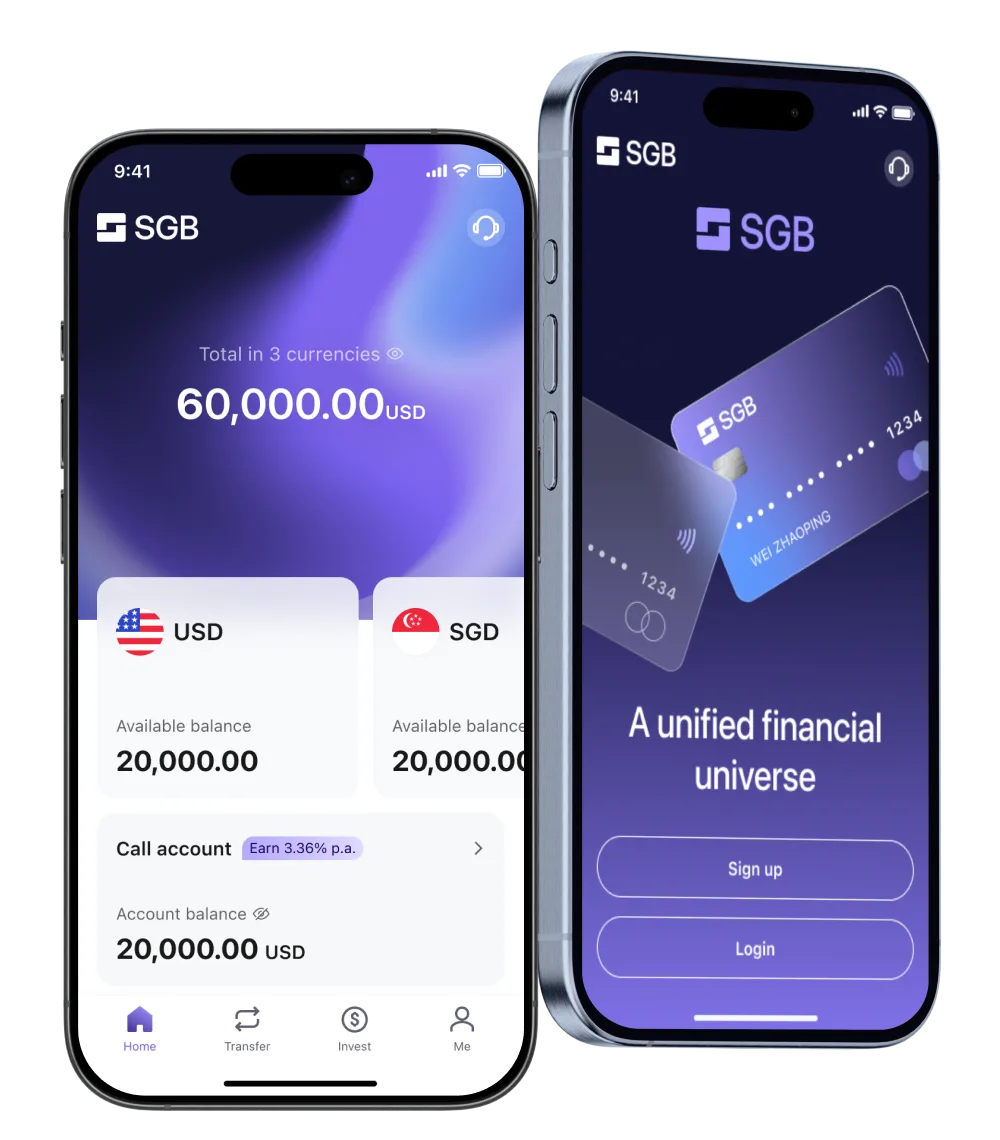
SGB is a digital bank licensed by the Central Bank of Bahrain — the first to offer fully remote onboarding to retail and corporate clients across East Asia, Southeast Asia, and the Middle East.
Make cross-border banking feel as simple as banking at home. Hide the regulatory weight, surface the status, replace silence with clarity. Trust earned through transparency, not promises.
My Role: Sole Product Designer (Founding)
Team: 10+ PMs, 10+ outsourced FEs
Timeline: Q2 2024 – Q2 2025
Context: Restricted-region users, vendor-locked KYC SDKs, locked crypto APIs, SWIFT-only rails, layered compliance rules — none of it can be changed.
Decision: Treat every constraint as a UX problem, not an engineering one. Where the system can't bend, the language, framing, and fallbacks do the work.
Context: Different countries, different user types — crypto trader, cross-border SME, offshore allocator. Different KYC requirements, different fields, different review timelines. One app has to serve all of them.
Decision: One flow, smart branching. The complex user gets guidance; the simple user gets speed.
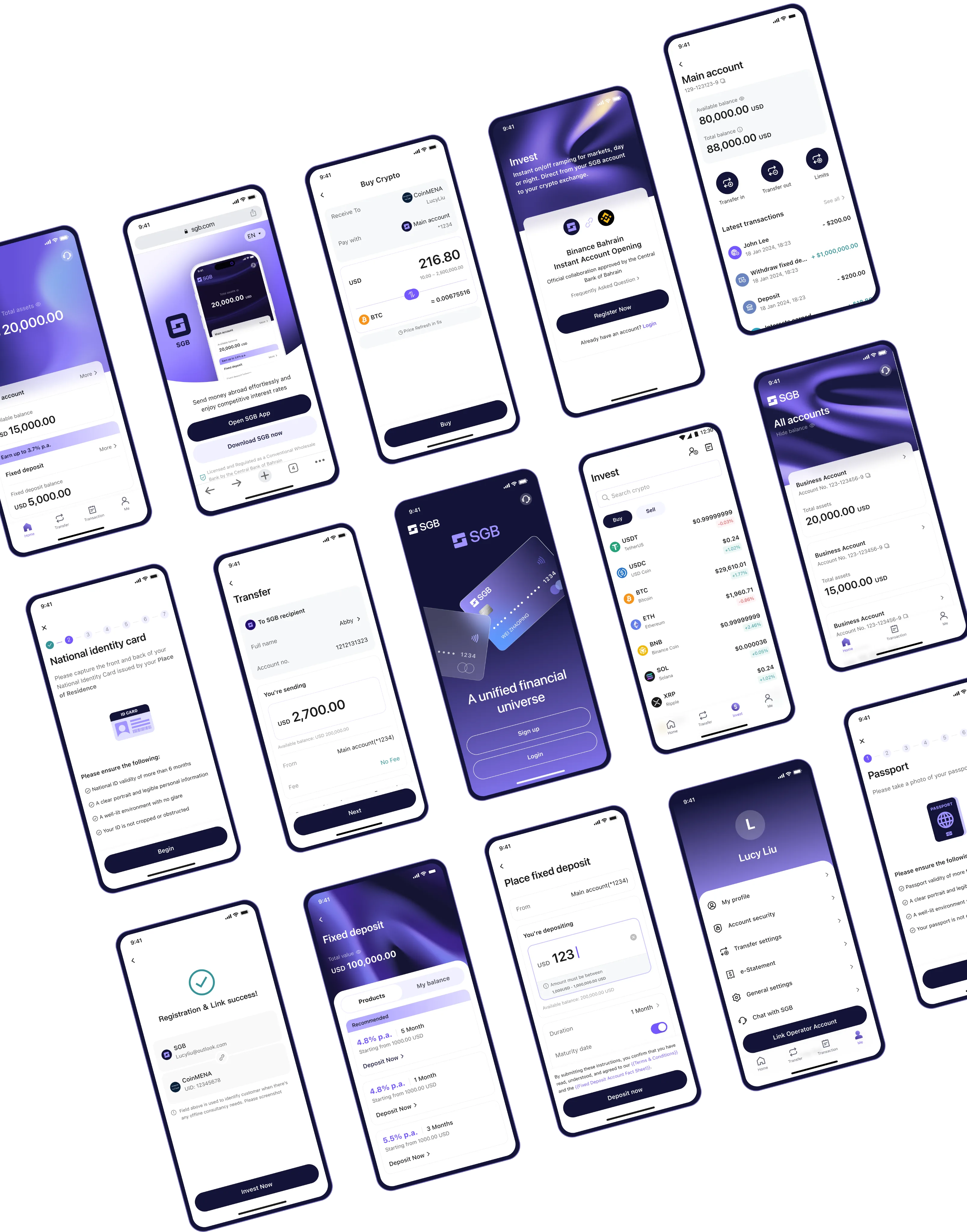
Context: 500+ screens App, 7 web modules, design system — solo, in 12 months. Can't polish everything.
Decision: Ship now, polish later. CS as safety net. Invest in design system over pixel-perfect v1.


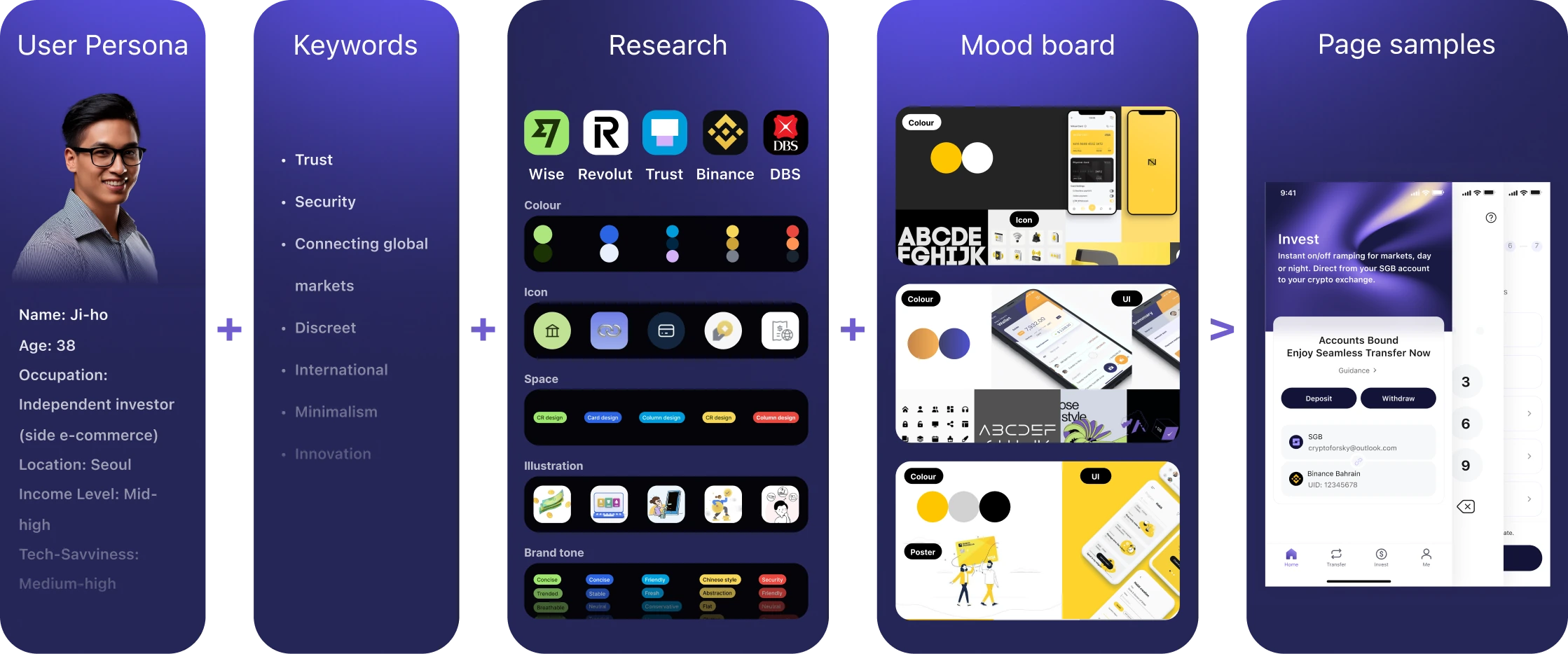
Onboarding as a case study — designing the best experience inside fixed constraints.
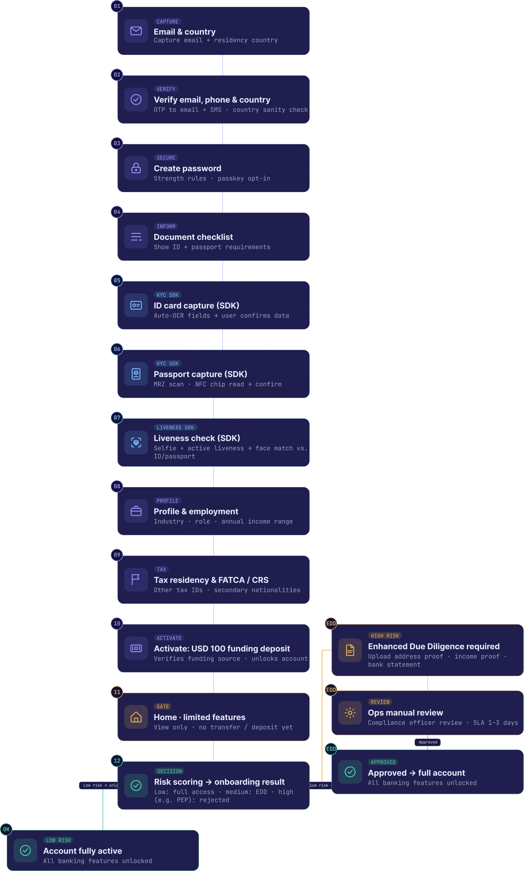
Problem: Some regions can't be onboarded — and compliance forbids naming which ones.
Design: Region check runs after email verification. Restricted users see a soft "we can't currently offer service — CS will follow up" and are quietly logged as future leads. A "no" turned into a "not yet."
Problem: Passport OCR & liveness SDK can't be modified. Glare and angle break it.
Design: Pre-shot guidance, live preview, retry-friendly errors, manual fallback after 5 fails.
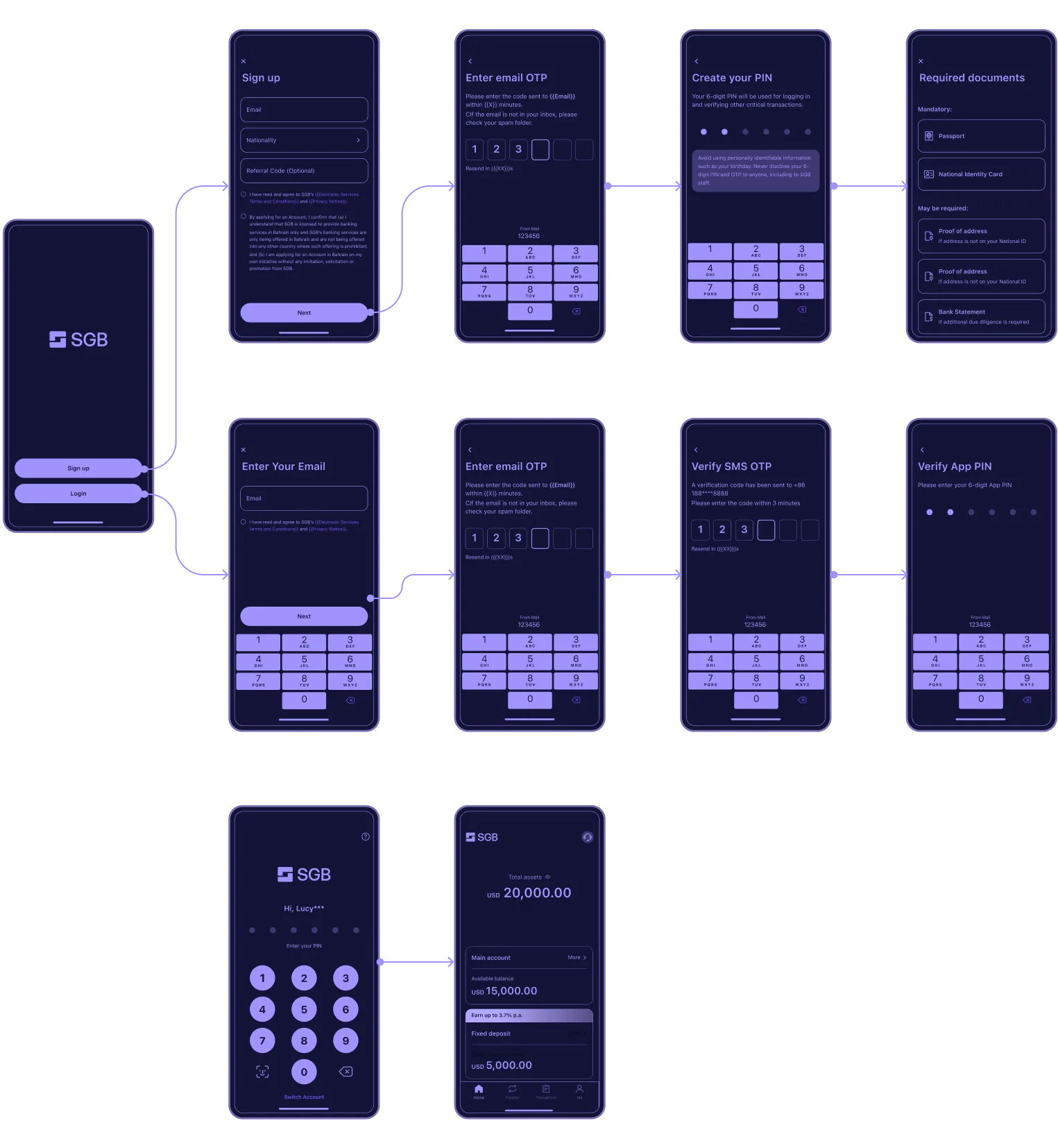
Problem: A 15-step KYC flow can't be shortened. Every step a user counts makes the journey feel heavier.
Design: Email verification stays outside the progress bar — users treat it as standard. The bar appears only when the real complexity begins: 3 stages, 6 visible steps. 15 underneath, 6 above.
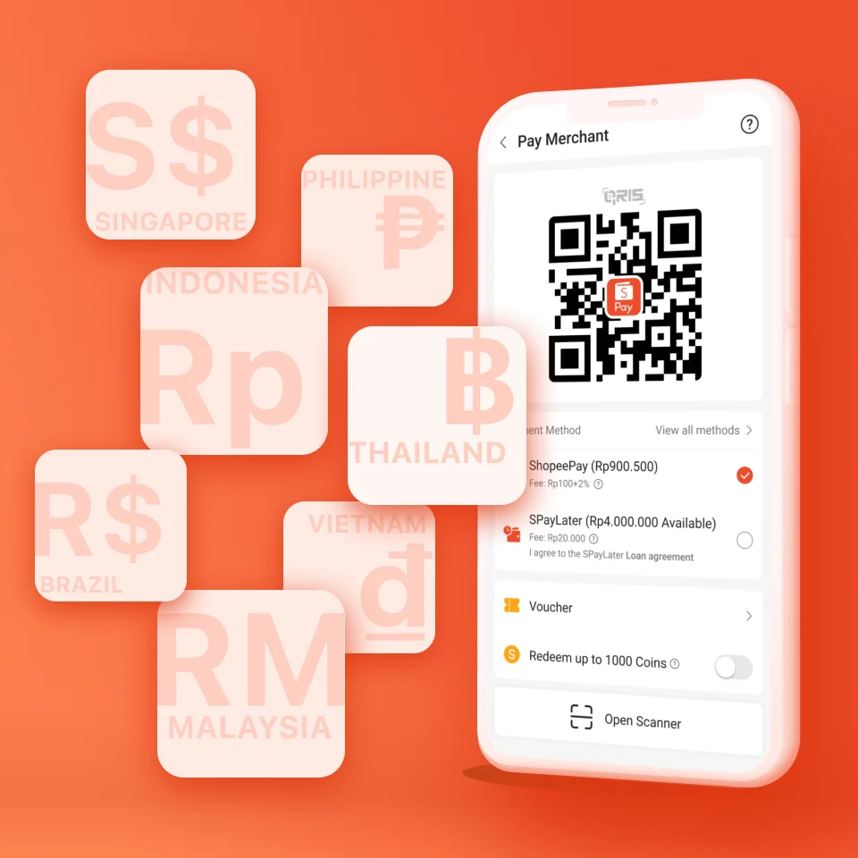
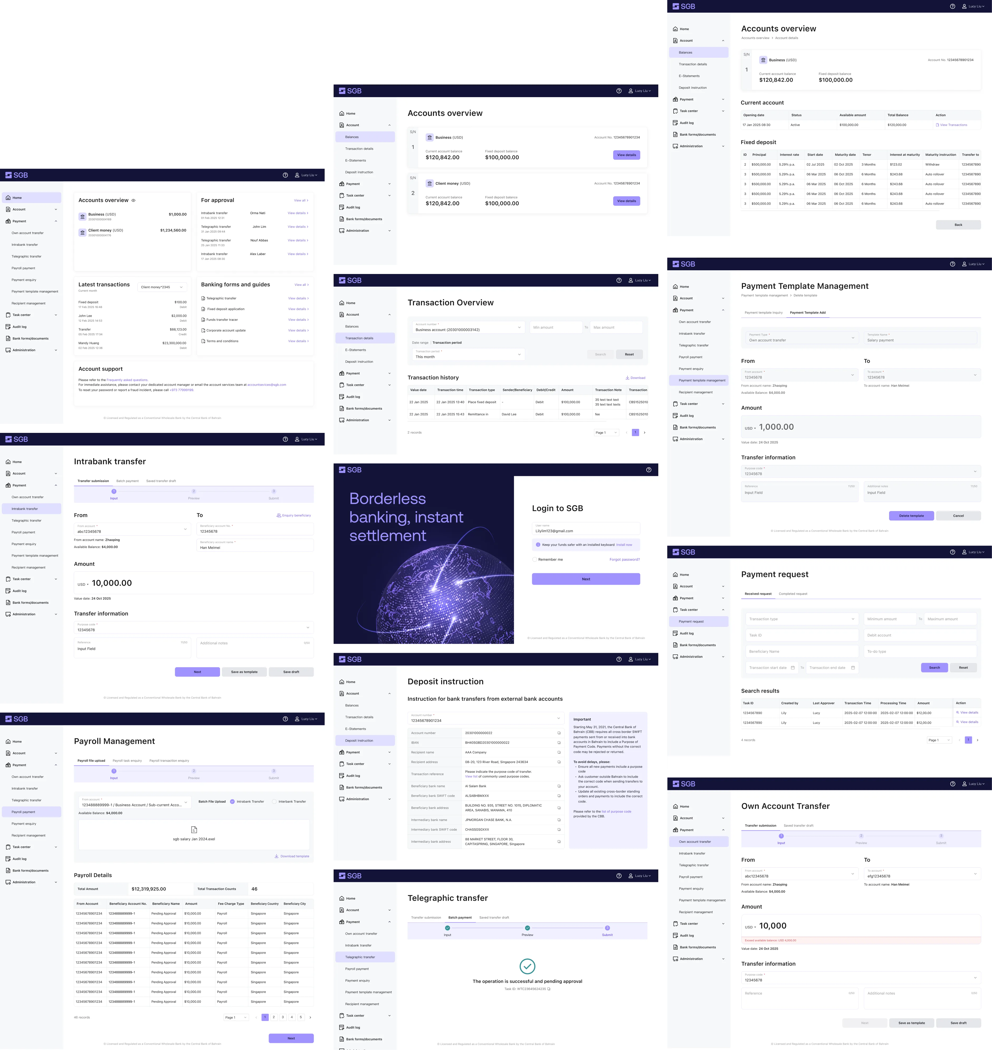
Problem: New bank, no SWIFT code — transfers route through an intermediary. Fixed reference string. $100 minimum to activate. The screen is dense with critical instructions; one wrong field kills the transfer.
Design: Tier warnings by priority — not every notice gets equal volume. The two copy modes map to different banks' input formats.
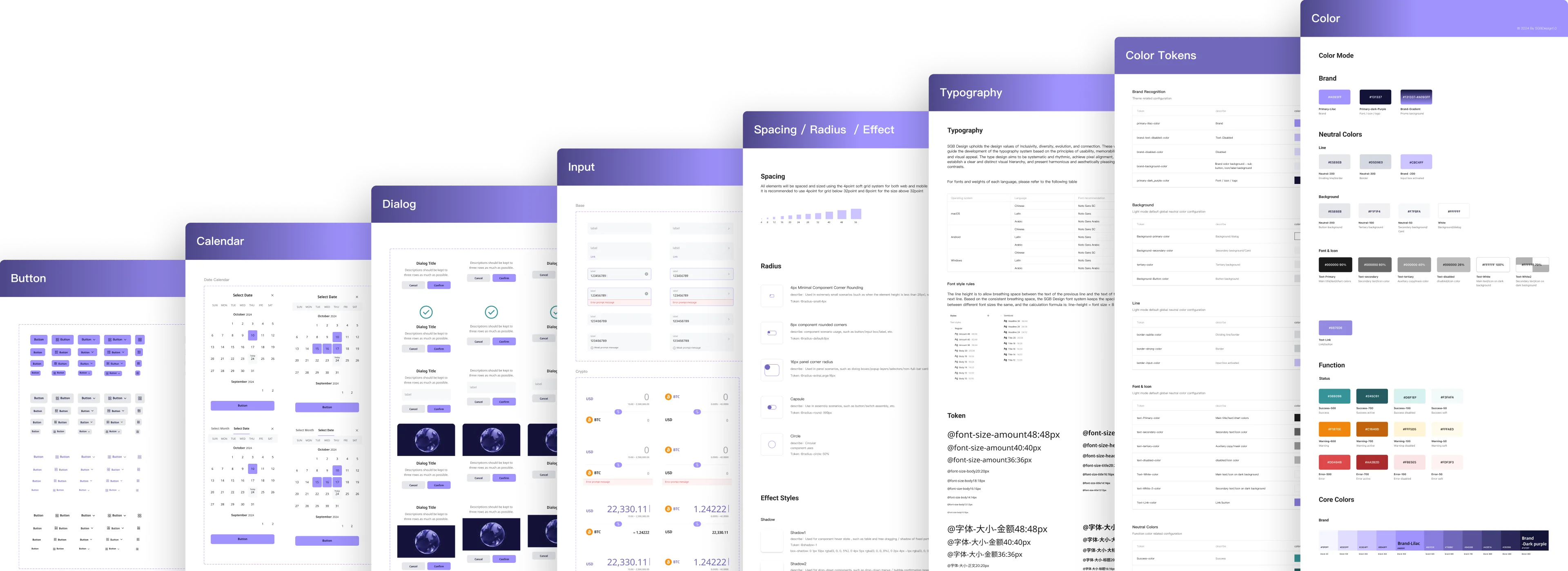
Atoms are universal. Composition is contextual. The same tokens and primitives served both platforms — only how they were composed changed. App composed them into cards, web into tables. One library, two contexts, one brand.
A three-layer system, informed by research: Shopee for multi-language patterns, Maribank for financial primitives, TDesign for functional taxonomy. Atomic (button, input, label) → Functional (PIN, OTP, beneficiary picker) → Scenario (transaction history, payment detail). 8px grid. Brand-color tokens.
Dev started with Vant — Chinese-first defaults, mobile-only, no RTL. SGB needed five+ languages including Arabic, plus a corporate web portal Vant wasn't built for. I pushed for Vuetify mid-build — multi-language by default, RTL native, desktop-ready.
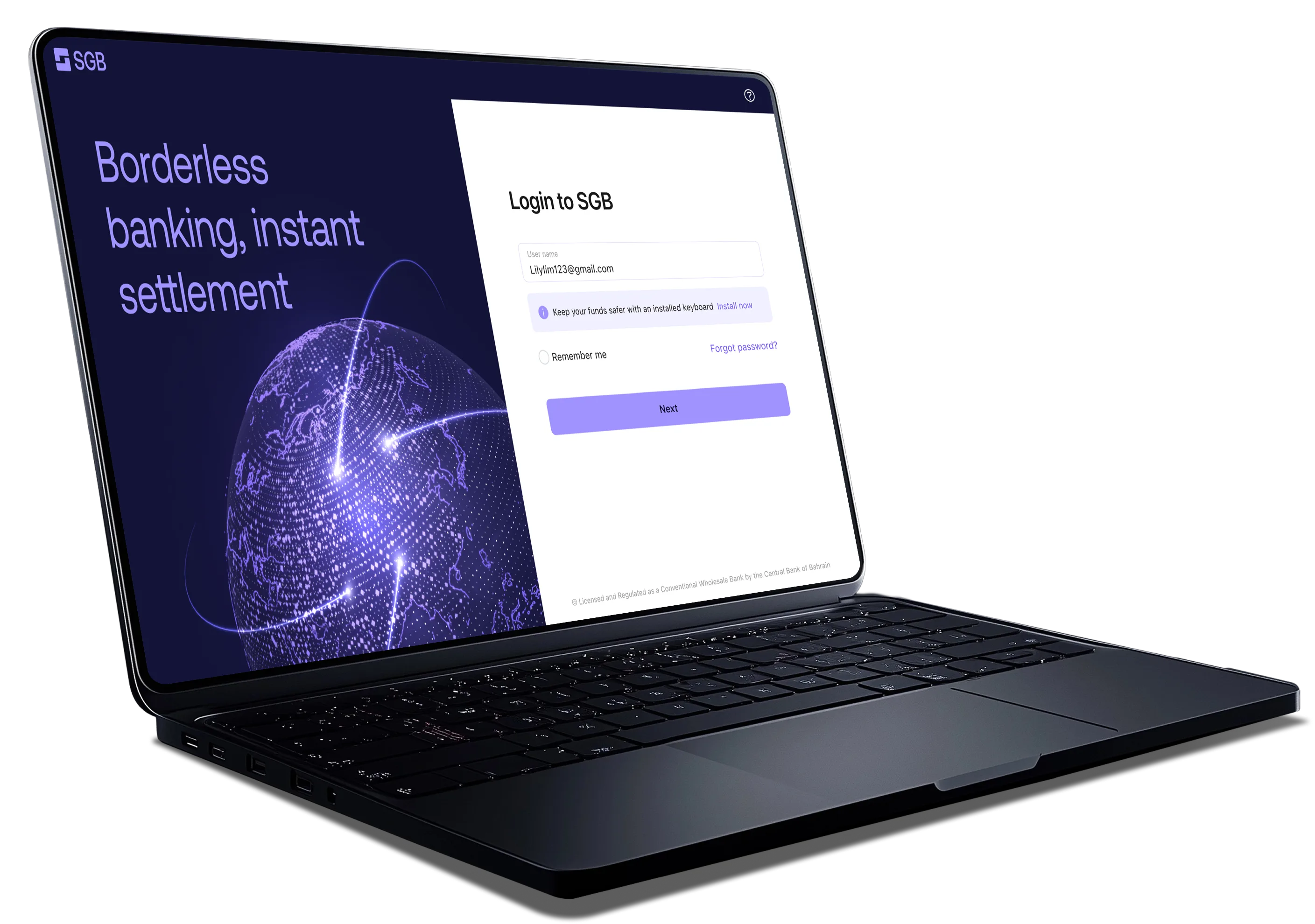
The Corporate Portal was 7 modules built on a vendor-provided core banking system. Most of the interaction logic — payment flows, approval chains, audit logging — came pre-built. My job wasn't to invent these flows. It was to make them feel like SGB.
That meant translating vendor scaffolding into our component library, choosing which capabilities deserved primary navigation, and holding visual + interaction consistency with the retail app.
v1 launched on schedule. The product is now live across multiple Asian markets, with the first wave of retail and corporate users onboarded. Early CS feedback shaped v2 priorities — most notably the cross-border identity edge cases noted above, addressed in subsequent updates.
Click and Drag


